Towers & Titans
Towers & Titans was a hero tower defense game, based around collecting "titans". I worked on T&T for over three years. In that time I worked on an MVVM framework to build the screens, and multiple layout classes that helped layout the UI more reliably.
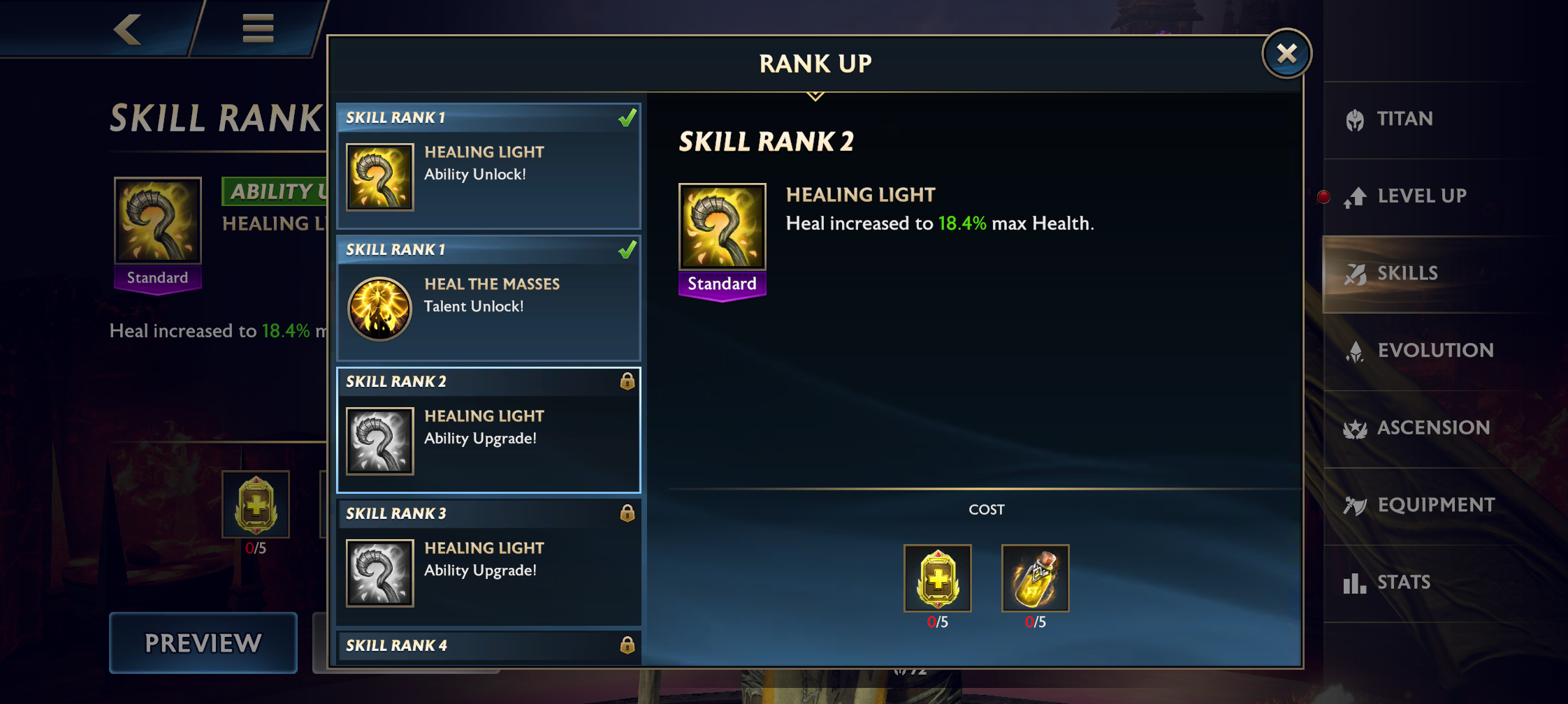
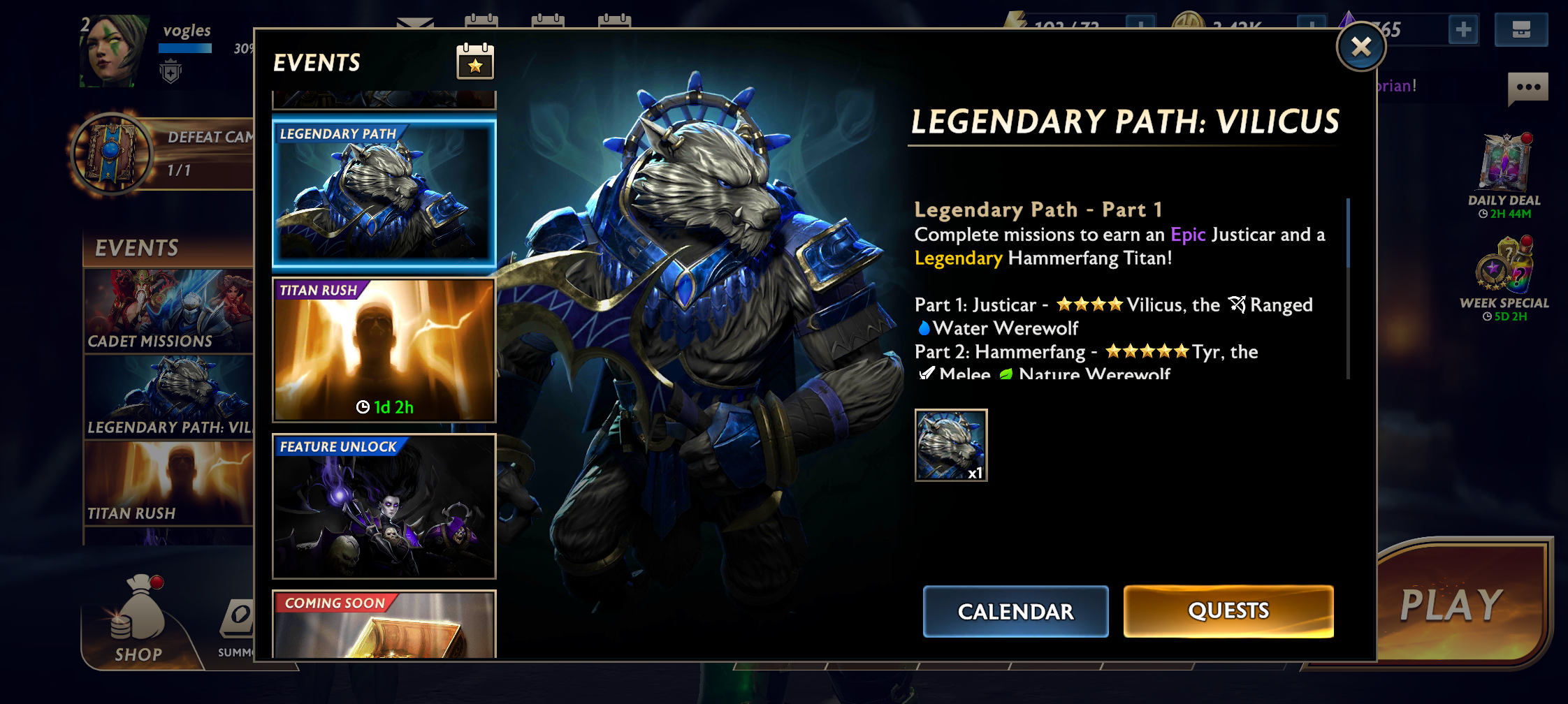
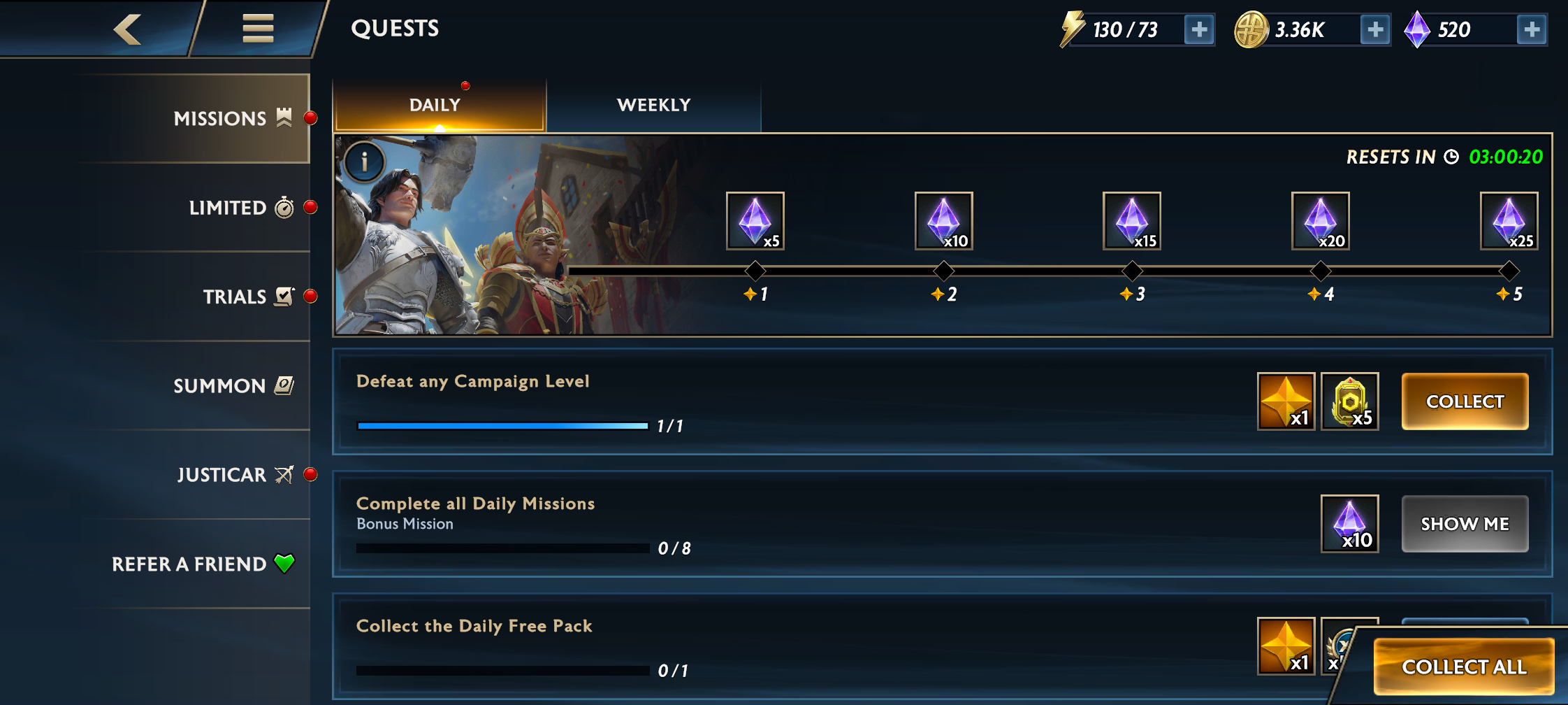
Over the years, several screen designs and layouts were updated. While the game was high fantasy, we still wanted the UI to be a bit modern. We also wanted it to be consistent across the whole game. Pre-existing screens got a face lift, while others were created using the same design style.
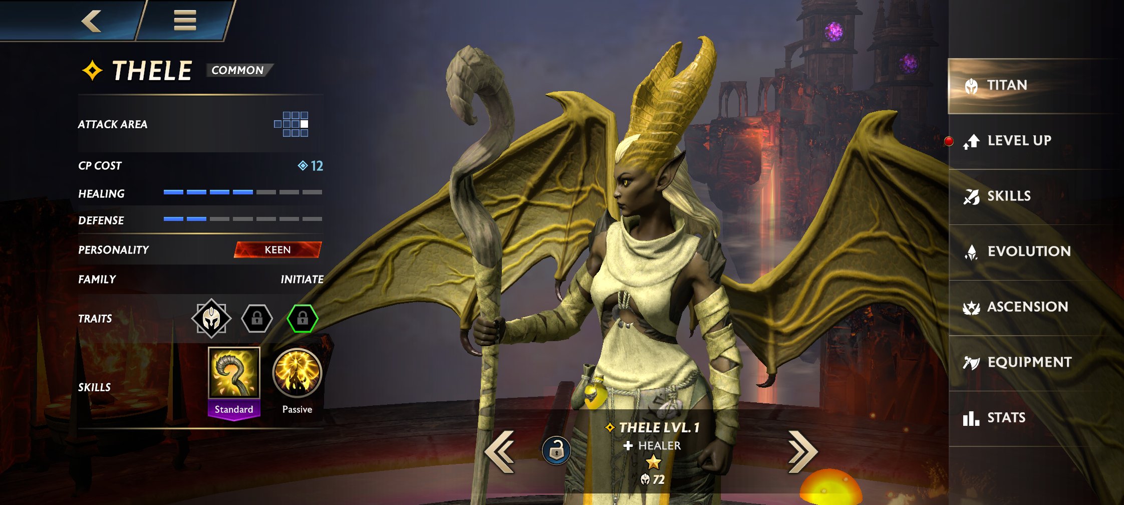
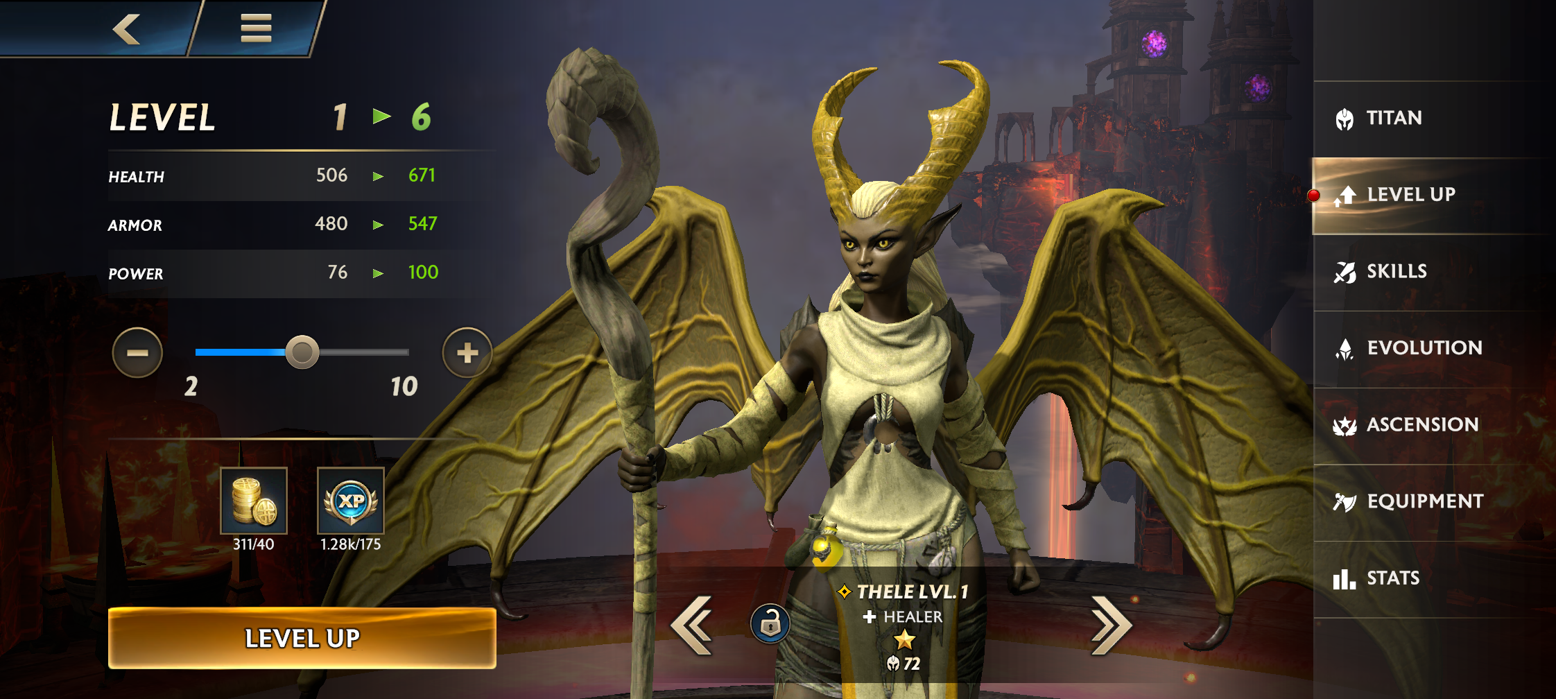
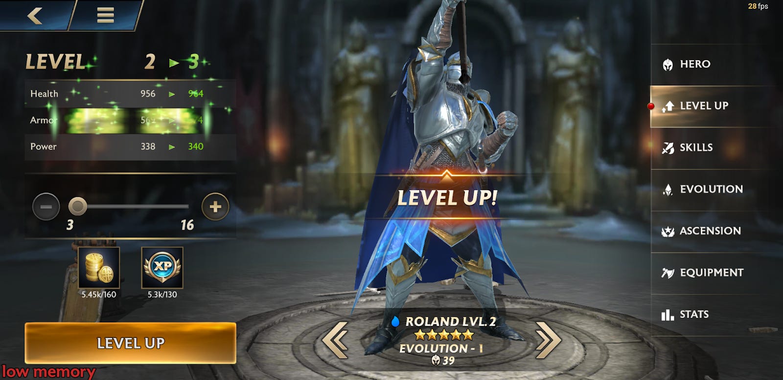
Hero Progression
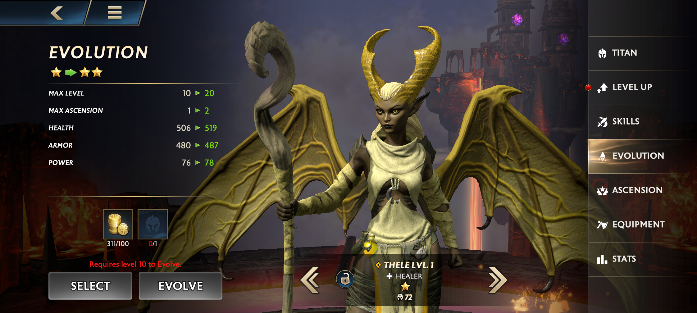
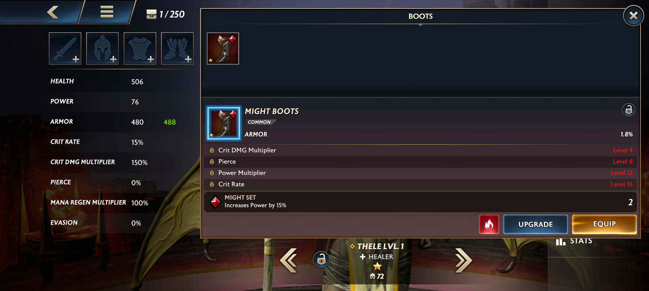
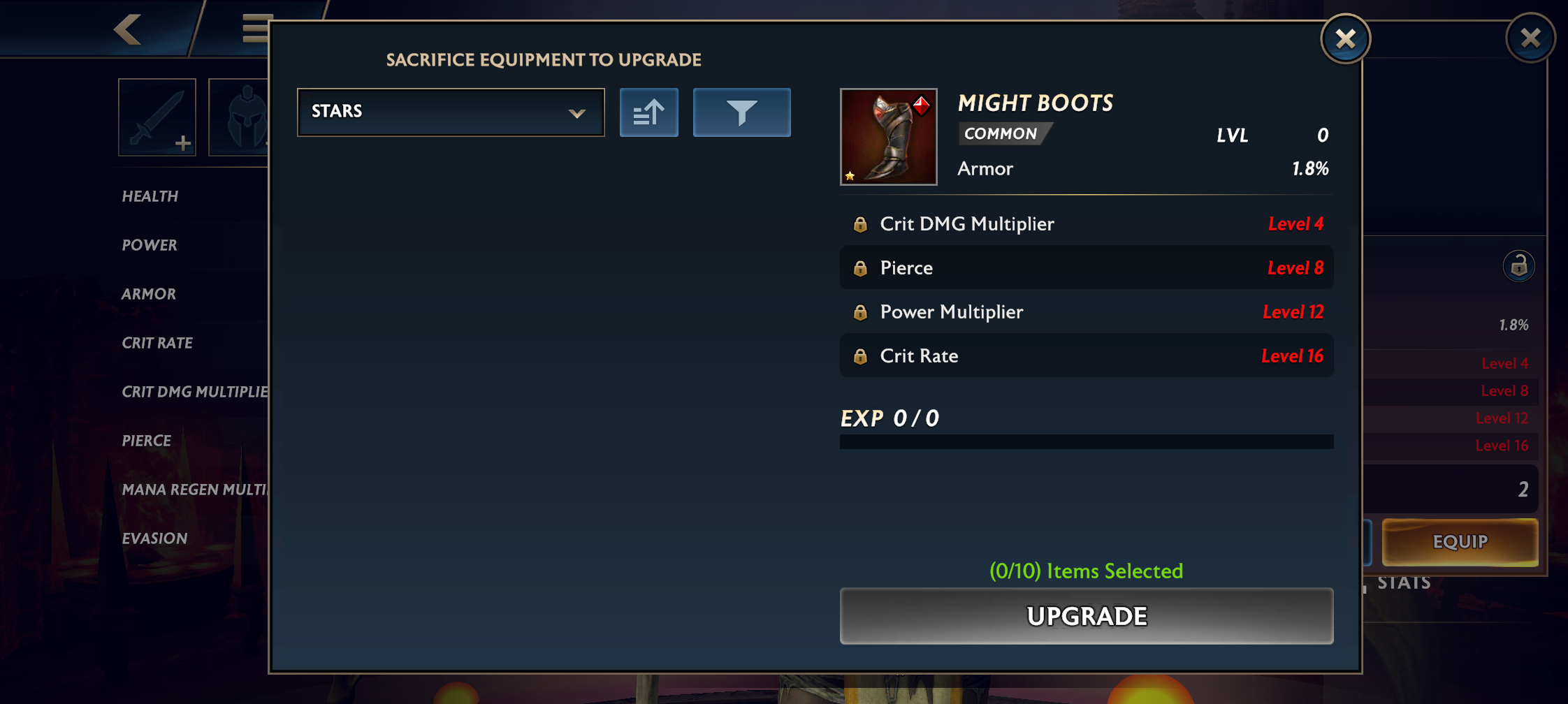
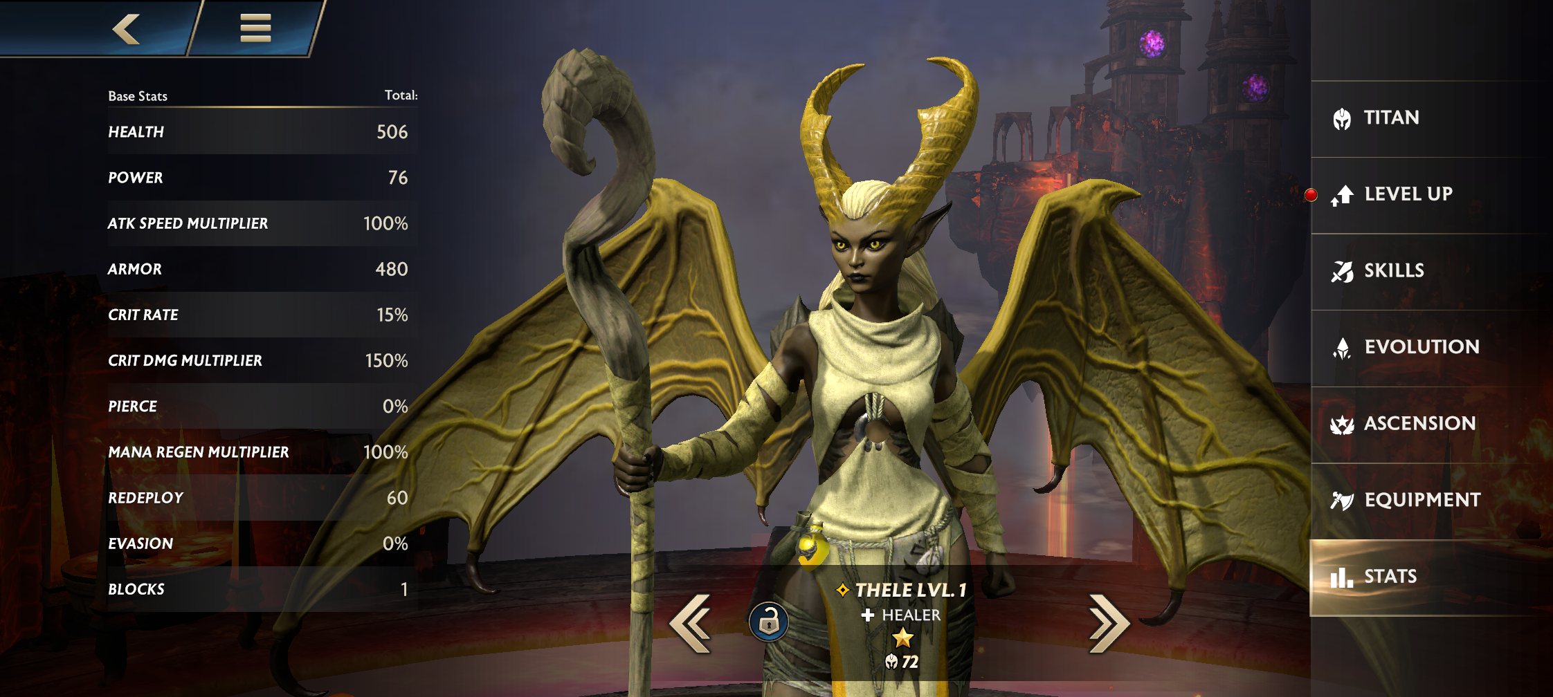
One of the first screens I worked on was the hero progression. It would come to define the UI style we would end up using across the game.
Old version
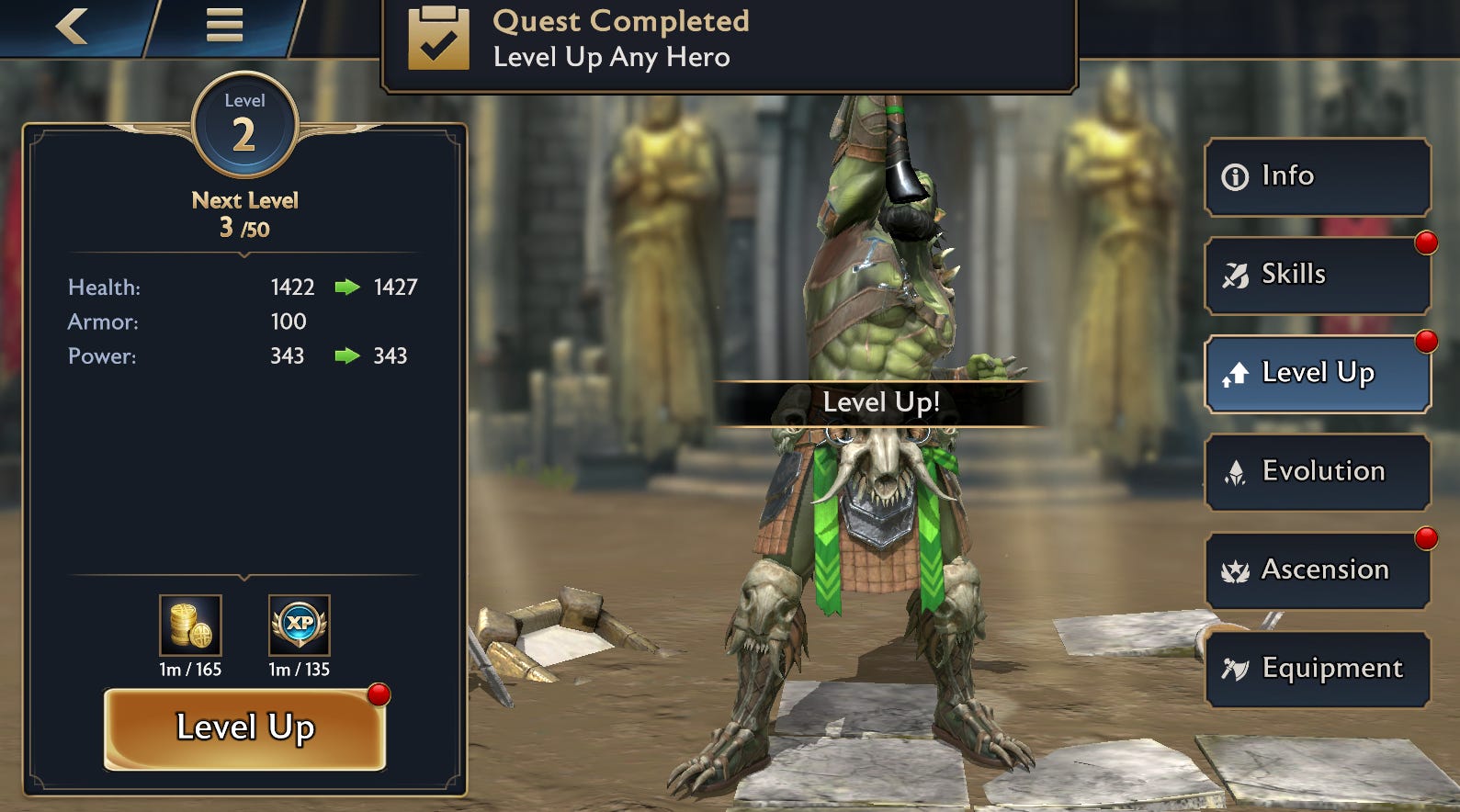
New Version
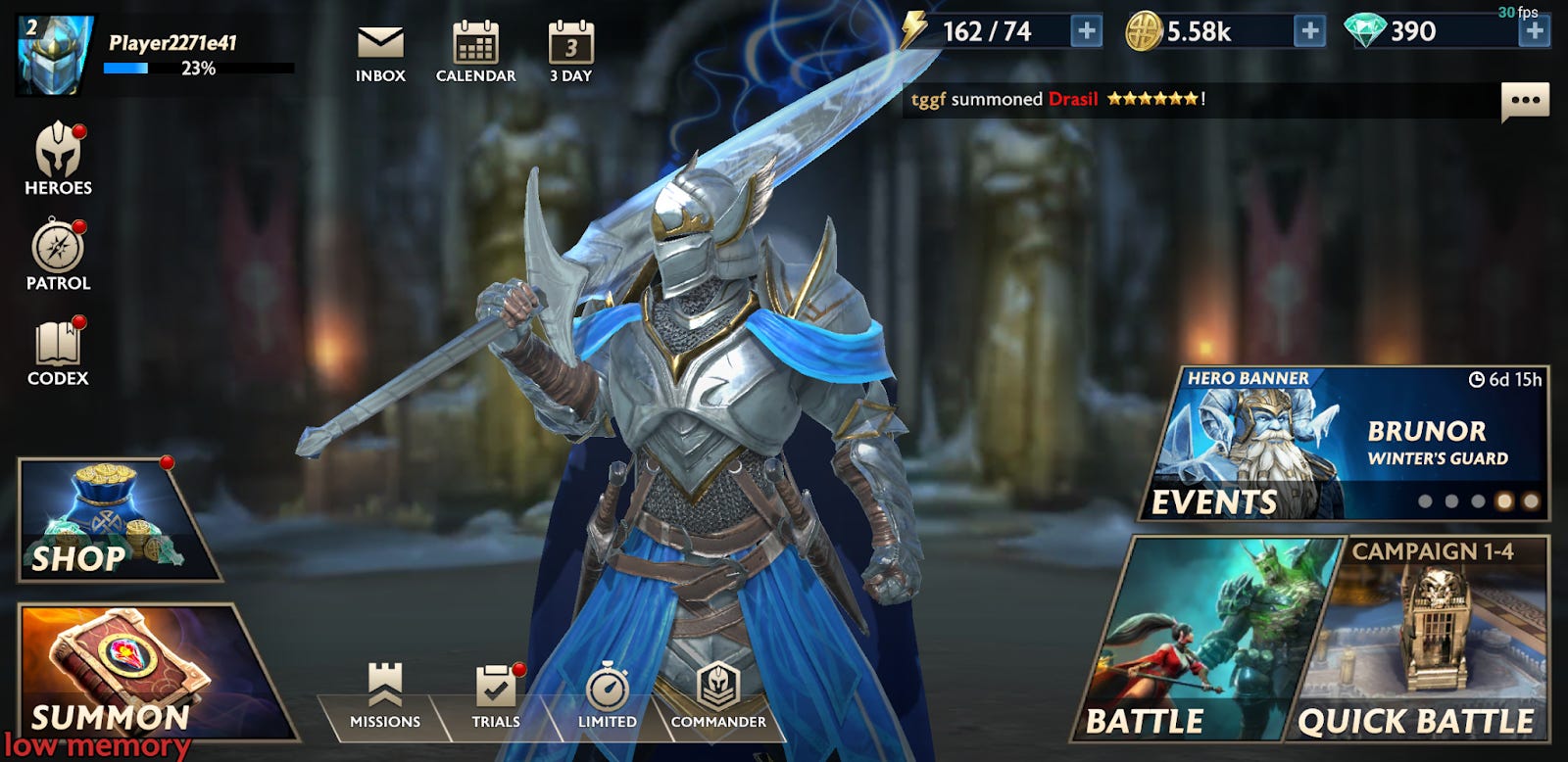
Home screen
The home screen began incorporating non-rectangular buttons. To support this and prevent players from accidentally tapping the wrong button, I overrode the behavior for taps and checking against an image mask to see if it should handle the tap.

Summon Screen
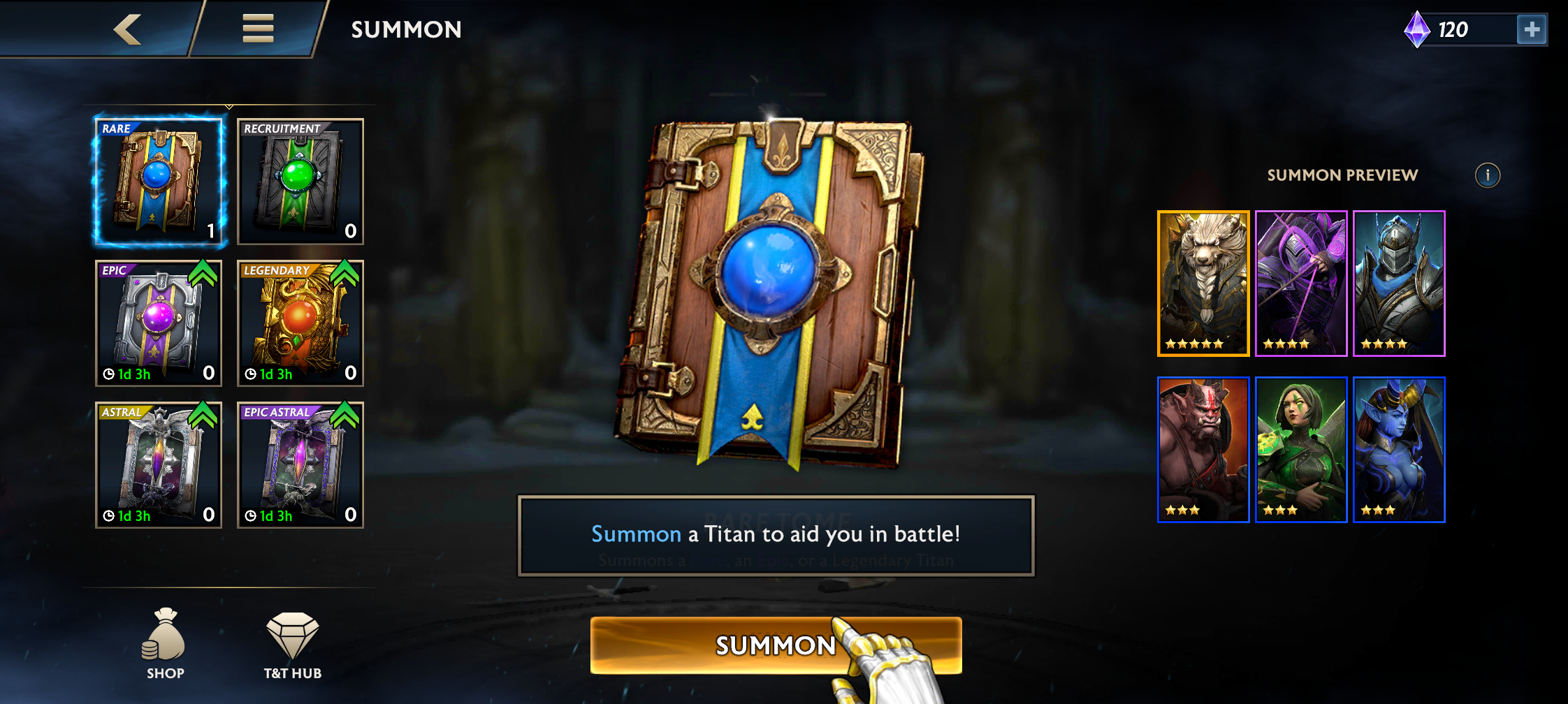
The summon screen and animation was also updated. Players would earn scrolls and they would be able to summon up to ten at a time. We decided we liked "tomes" more. Artists could create cooler looking tomes, with varying amounts of embellishments to show how epic the hero was going to be. We wanted to update the summon screen to show off the tome art and visually help players pick a tome that would be exciting for them to open.
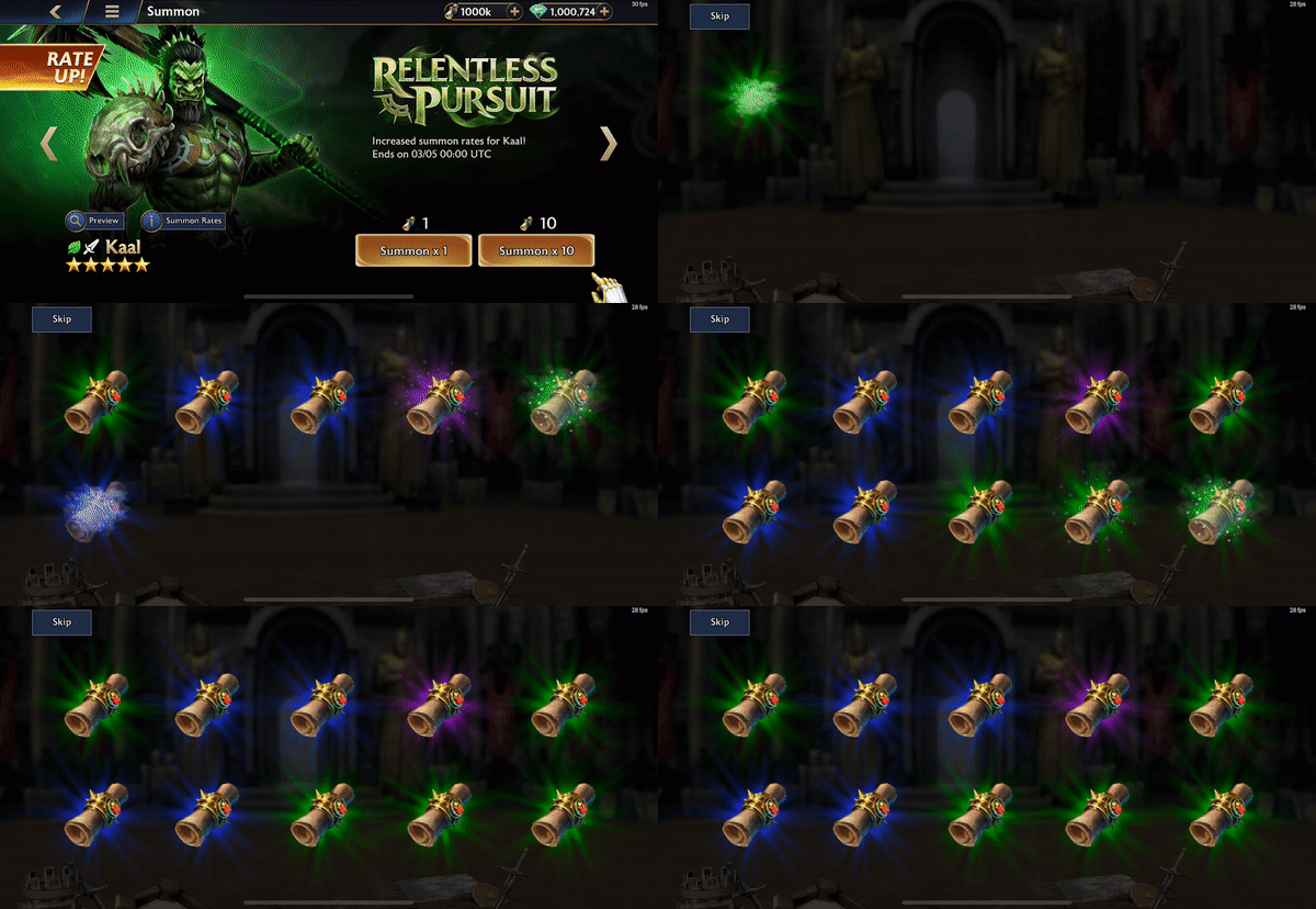
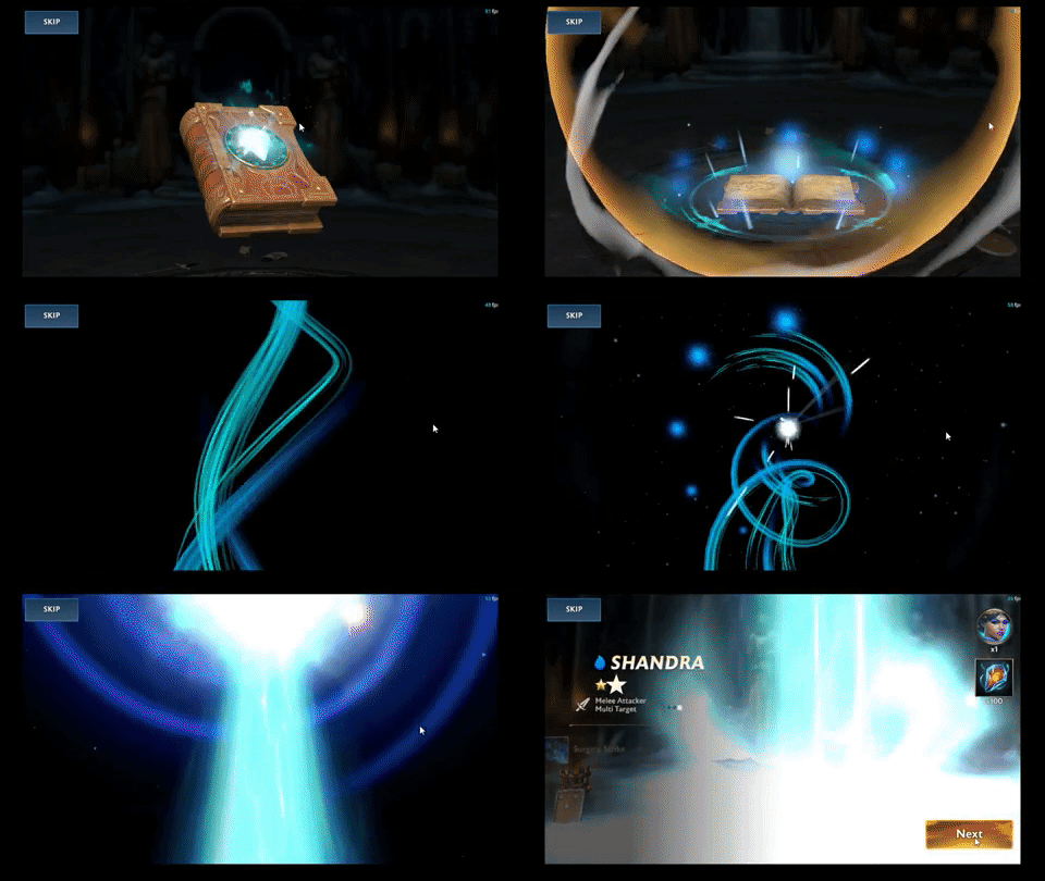
The summoning animation sequence showed scrolls popping in and the heroes would appear. We switched this to a tome
appearing that players tap on to trigger a big portal animation, then the hero appears. This was accomplished using the
Timeline feature in Unity. Normally a Timeline requires references to any GameObject to exist for it to work.
Since we had all this cool tome art, we wanted to be able to show them off in the animation, too. I was able to instantiate
the tome the player selected and update the Timeline so the animation wasn't identical each time.
| Old | New |
|---|---|
 |
 |
Commander Missions
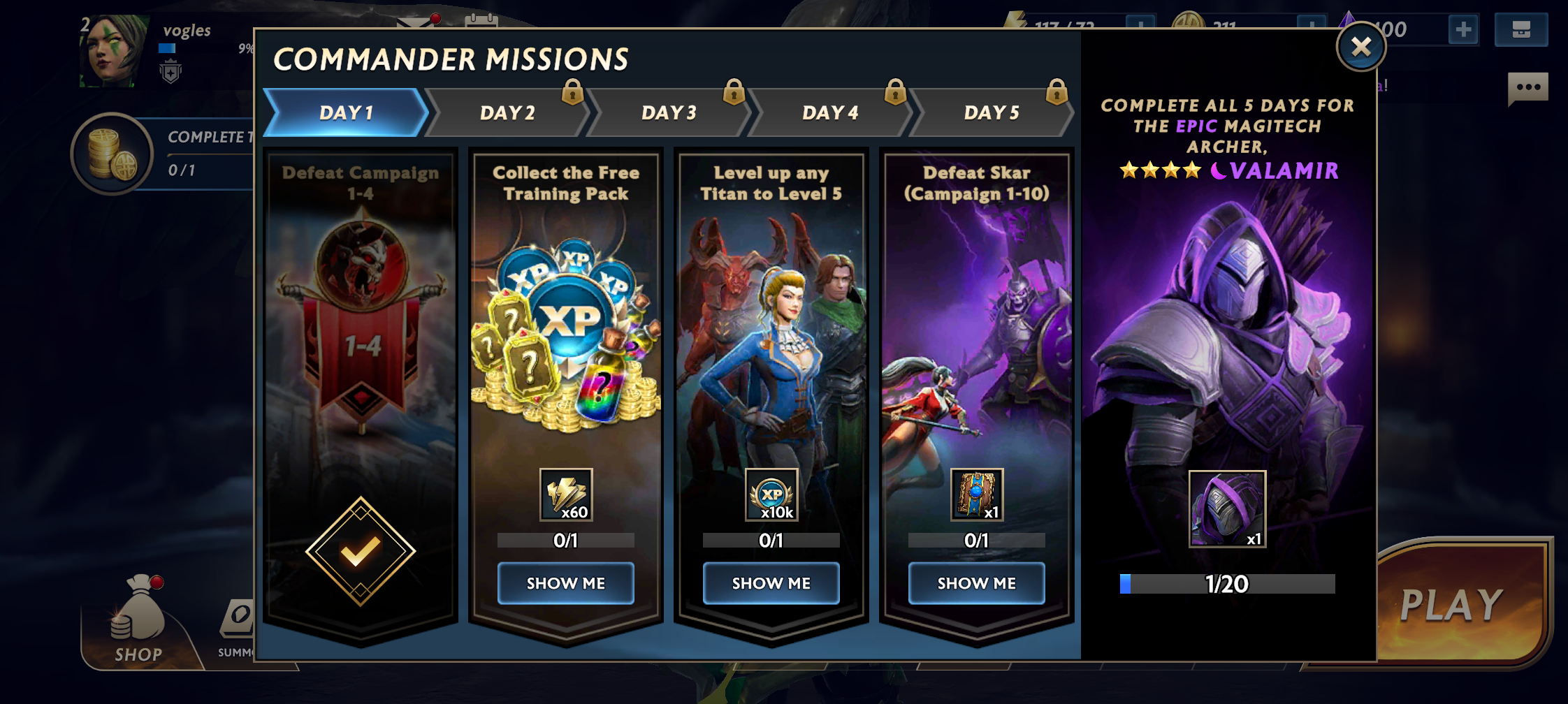
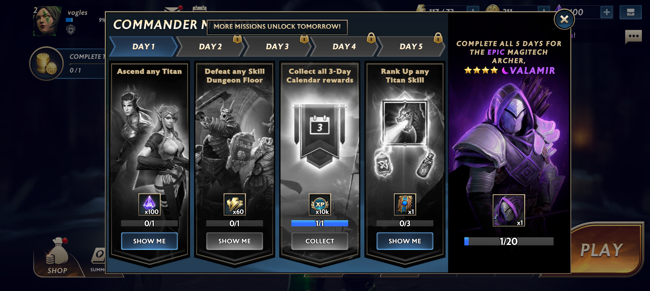
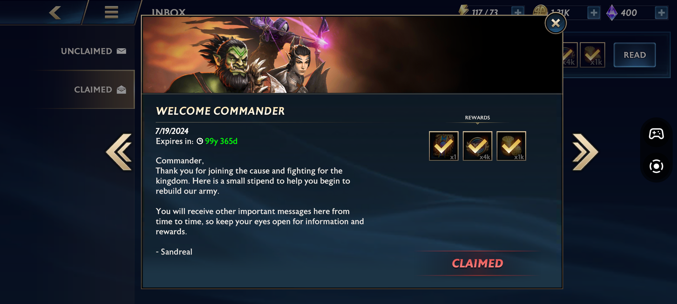
Commander Missions was a week-long set of quests. Each day the player would unlock a set of 4 quests. They could complete they before that day, but couldn't claim them until that day. The UI behaved like a list of pages, each having 4 list items.
PvP Home
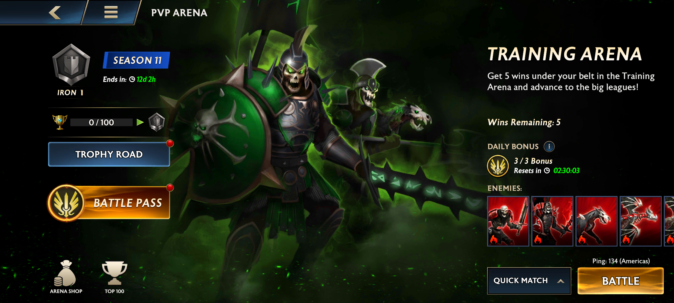
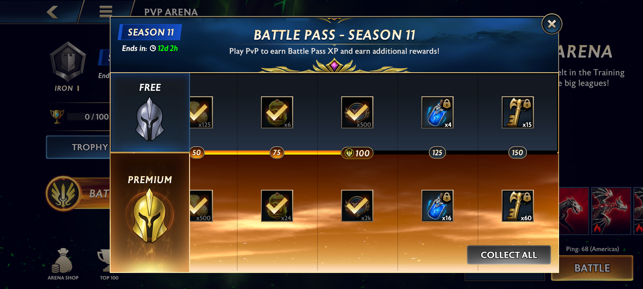
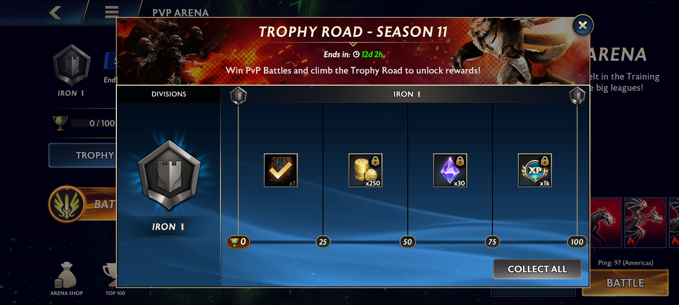
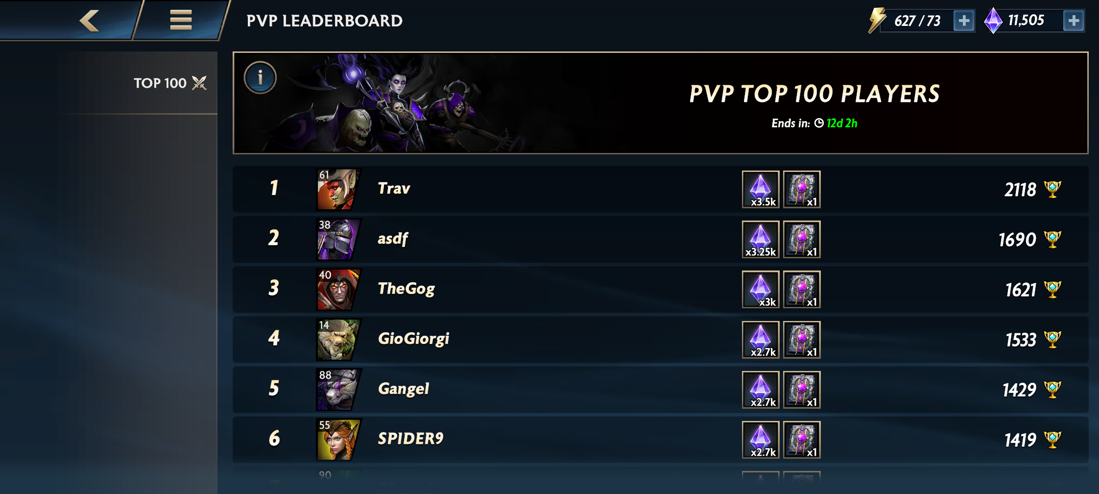
PvP was a major feature that took many months to finish. The UI went through multiple iterations, but eventually landed on what's below. We added a battle pass, ladder progression, and leaderboards to round out the pvp game mode.
Others
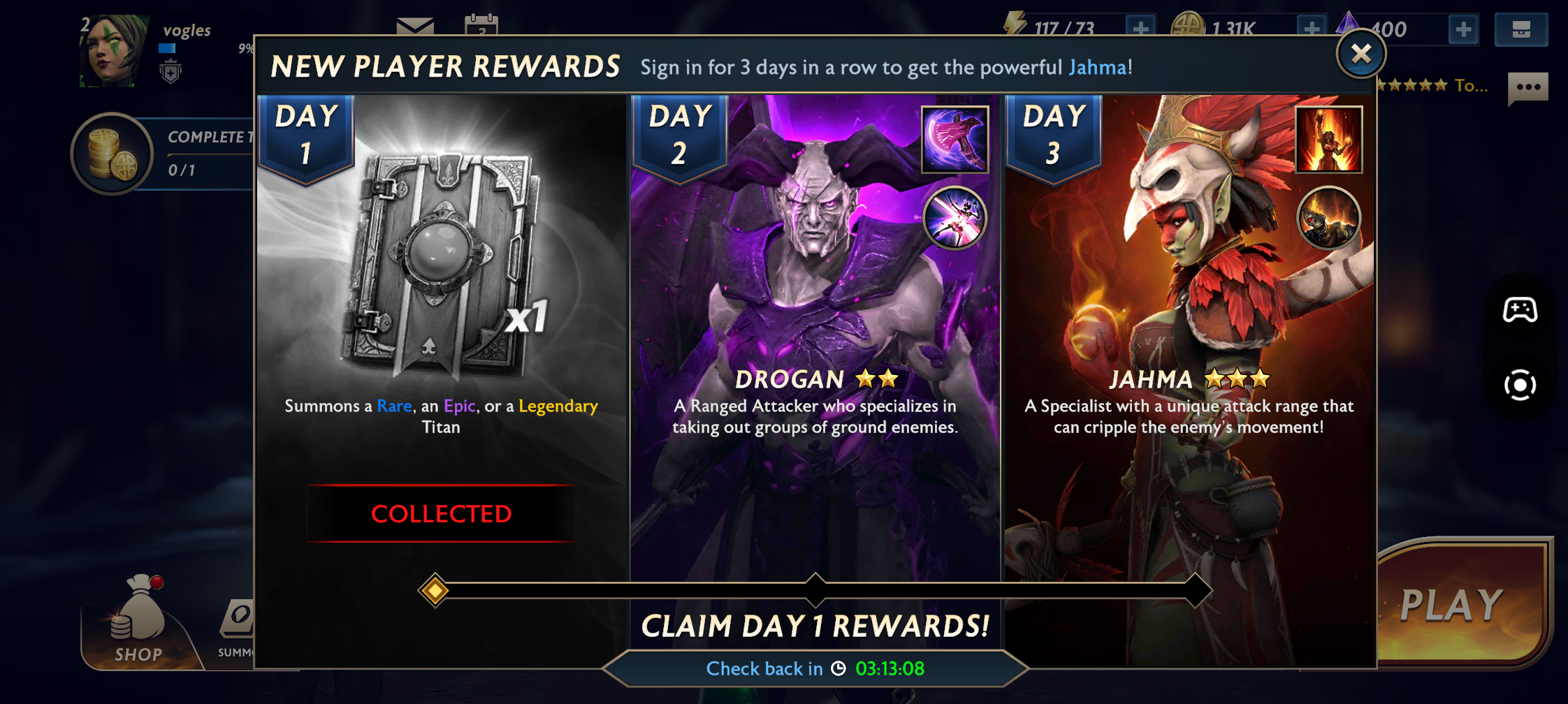
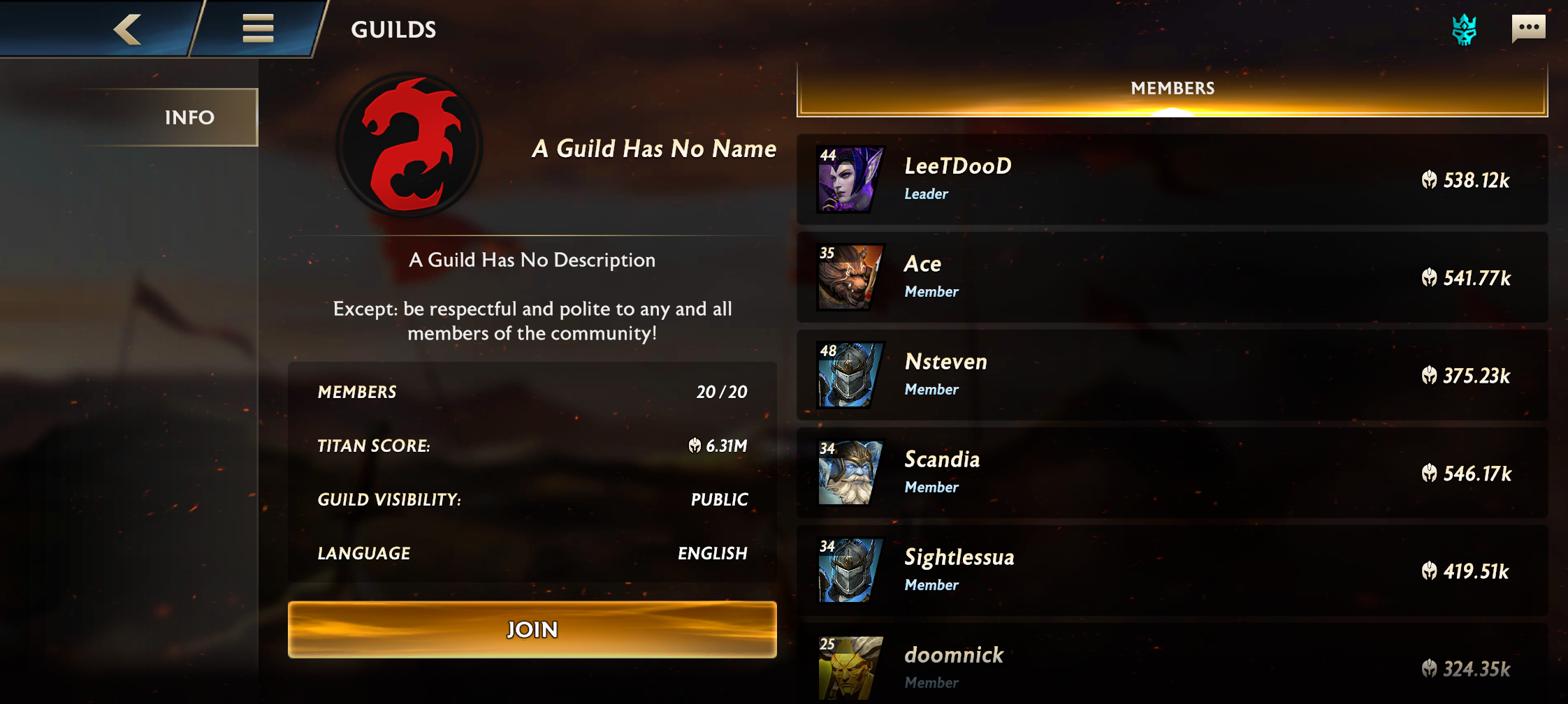
I worked on most of the UI. Sometimes I worked on improvements to existing screens. Other times, I created the fist version of a screen that laid the groundwork for future improvements by another engineer or designer.
