Vainglory
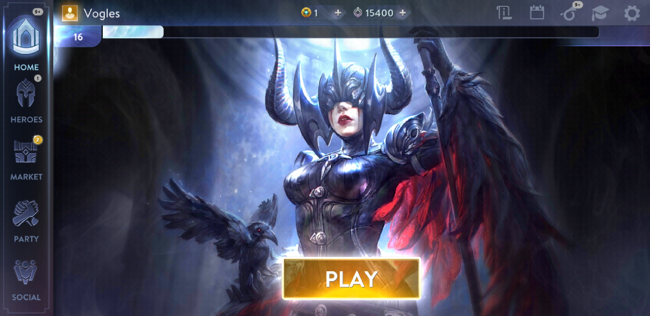
I worked with 4 other programmers and two UX designers to finish this new frontend within two months. I was responsible for the home panel (the landing page for the app). From here a player can enter or exit a game queue. At the top, players can access their profile, view the latest news, or access their available quests.
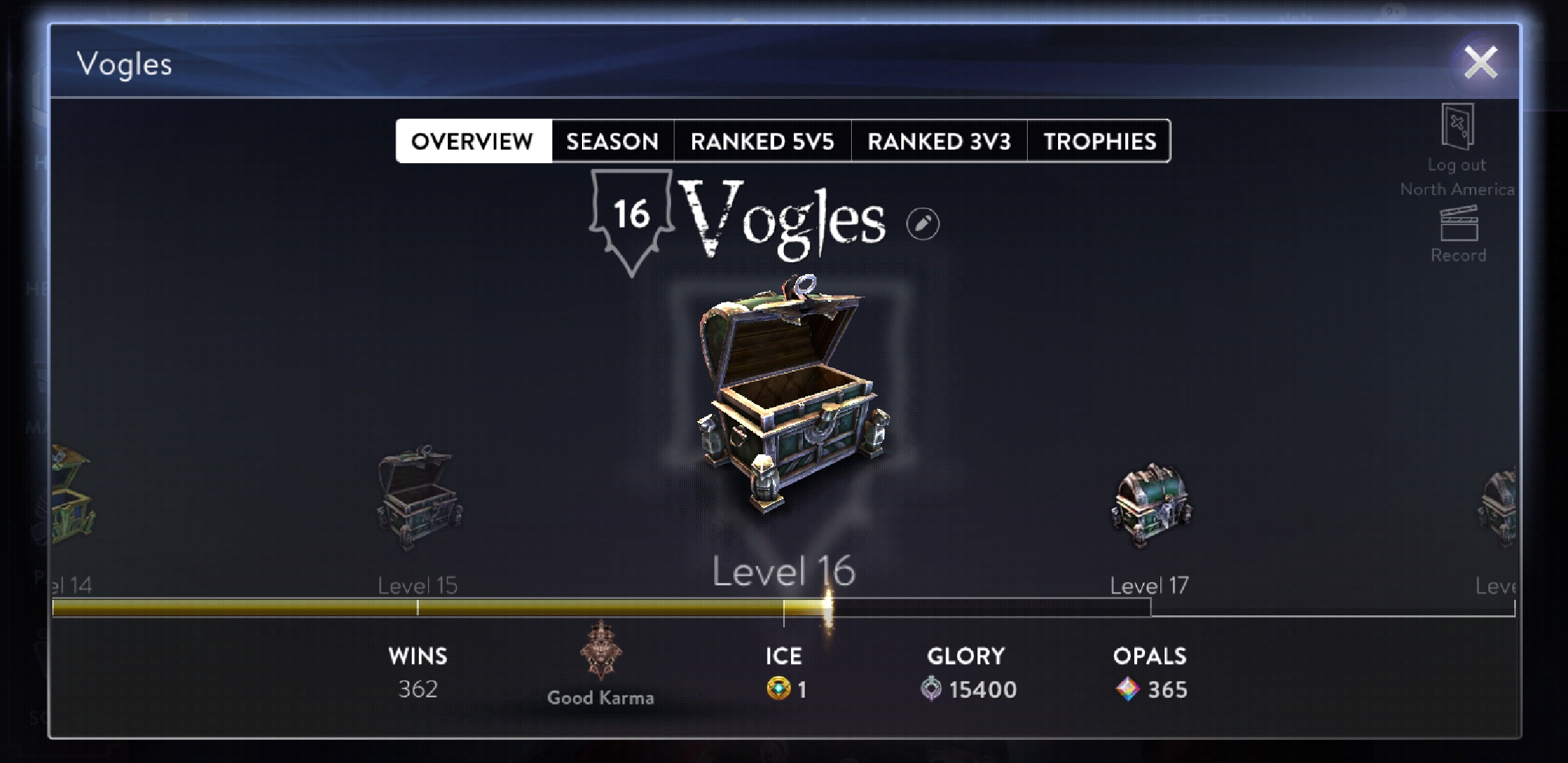
While the layout of the new frontend is completely different, not all of the older screens were remade. In the case of the player profile, I worked to update the screen so that it fit in a popup window, which was more confined that the full screen real estate it enjoyed previously. This meant refactoring old code that had not been touched in a long time, so that it can fit properly in the popup, but also look like it was supposed to be that way the whole time.
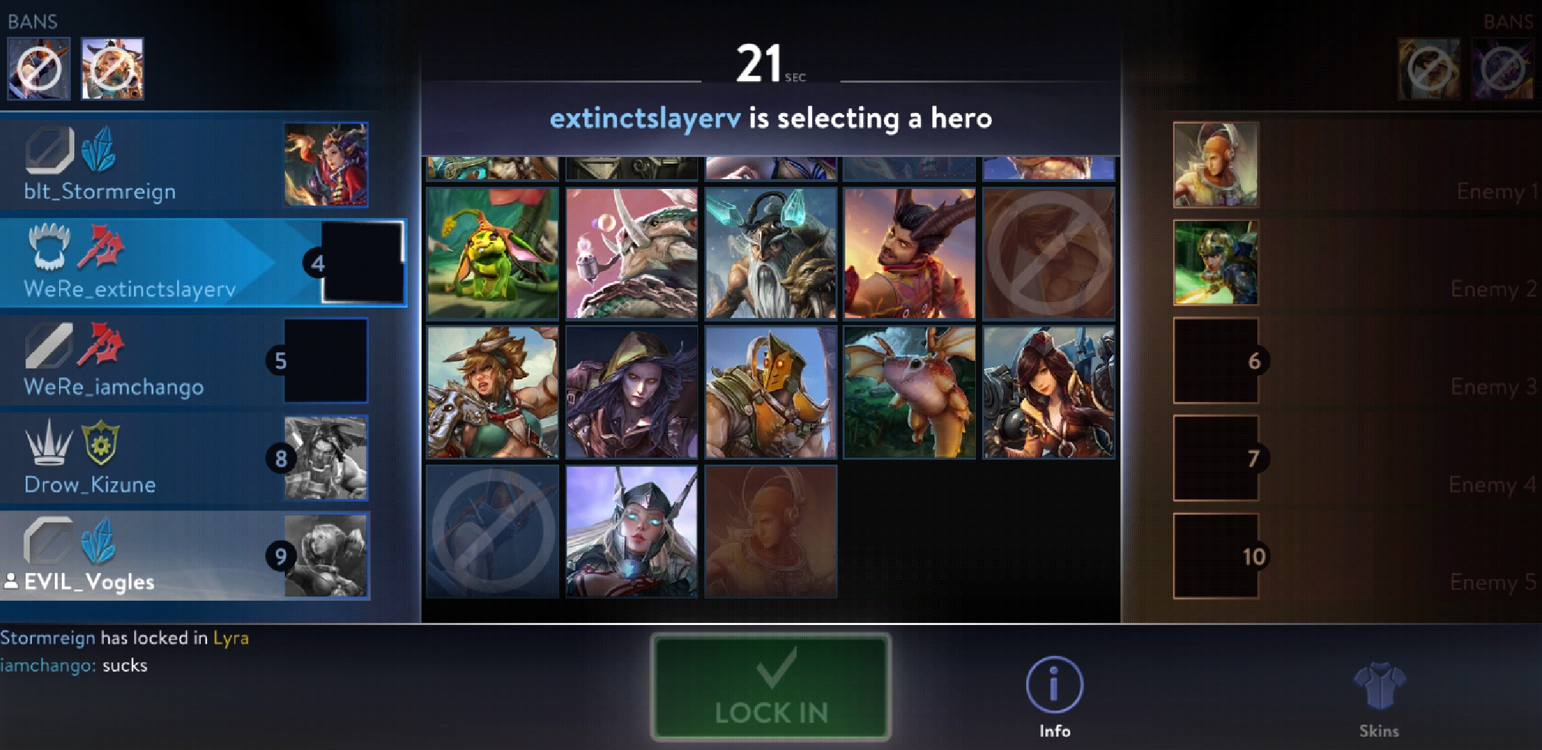
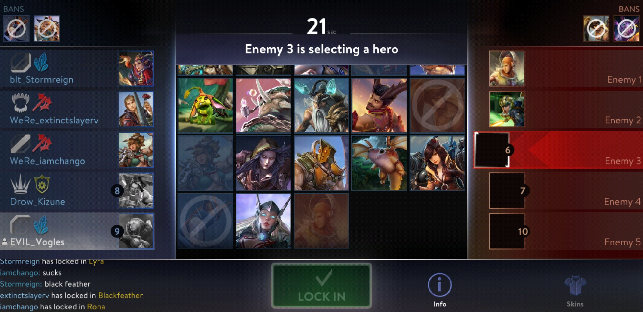
I worked with 3 other programmers and two UX designers to develop this feature within a month. My tasks included implementing the player tiles, which shows information about the player. This included the hero, lane, and build selected by the player, in addition to the pick order and which team the player is on, which is determined by the server.
I also worked on the swap dialog, which would allow players to swap heroes after everyone has selected.
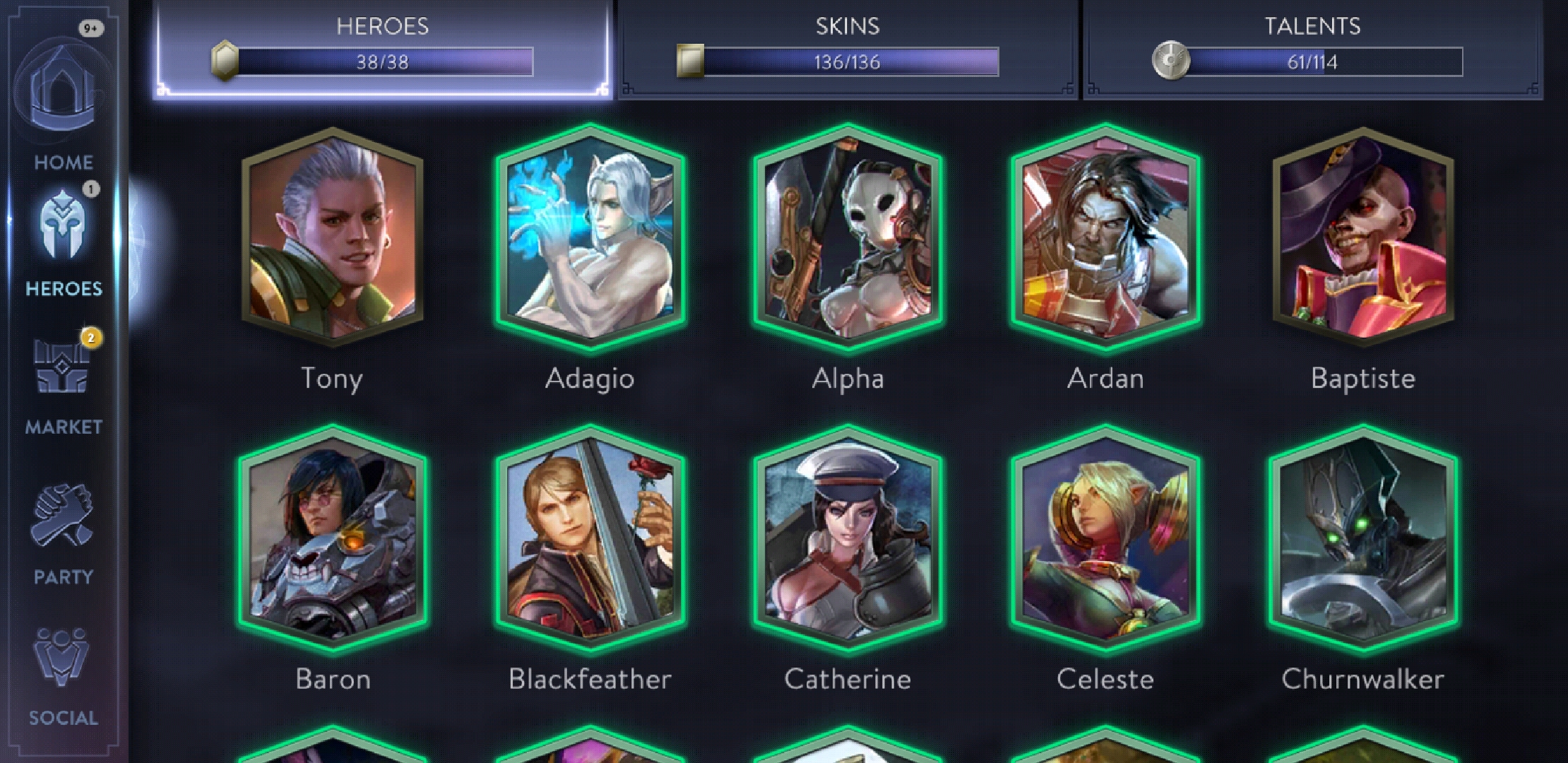
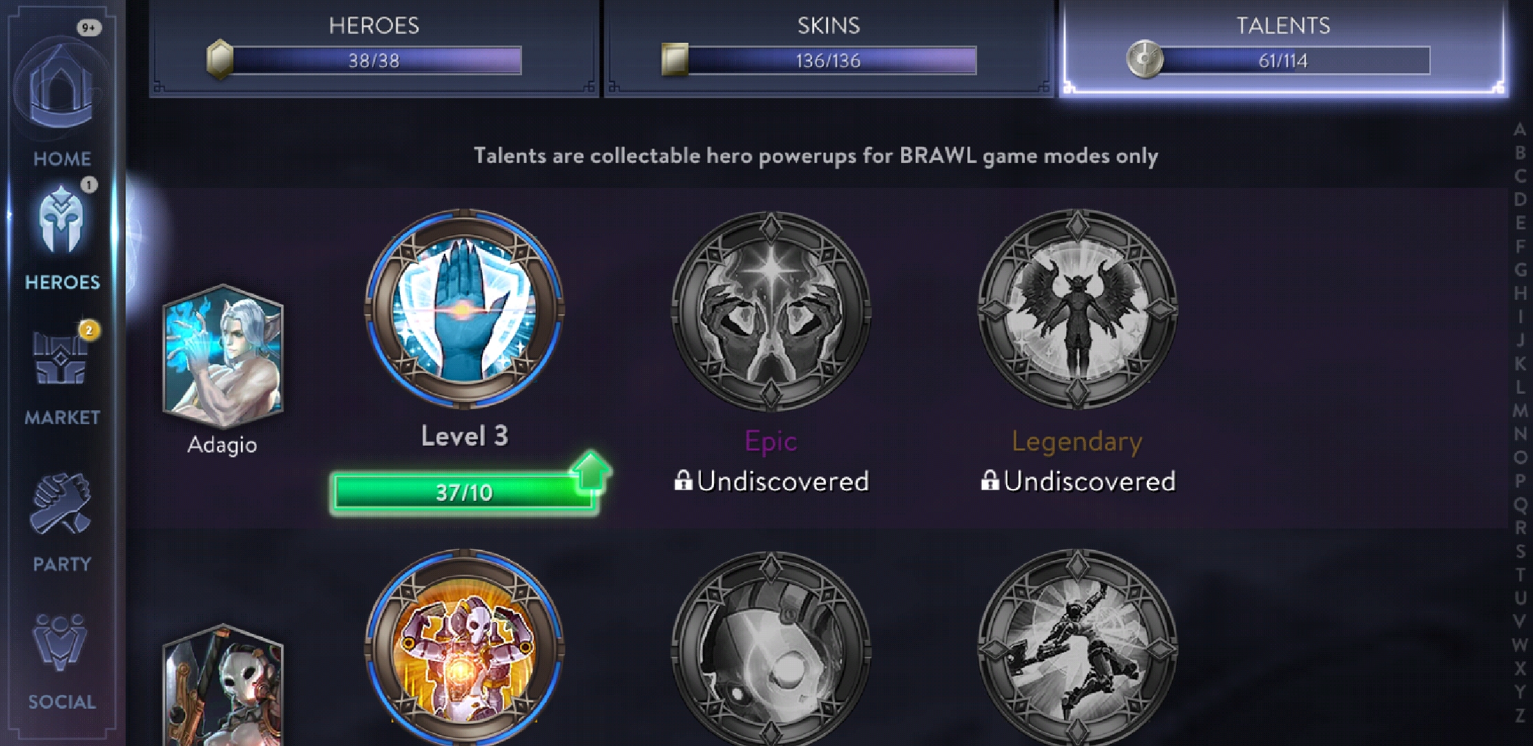
I worked with a UX designer to implement the new Hero Browser. This is a compendium of Vainglory’s heroes. It shows which heroes, skins, and talents that you own. From here, you can buy heroes, craft additional skins, or upgrade available talents.
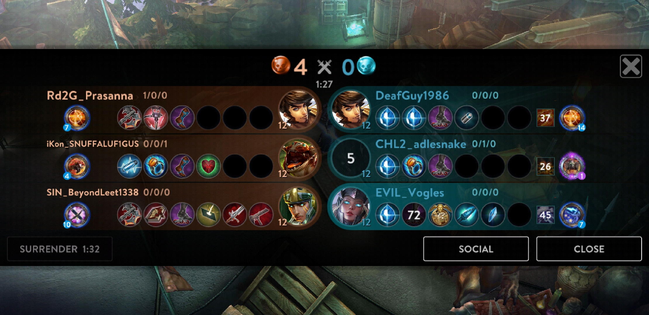
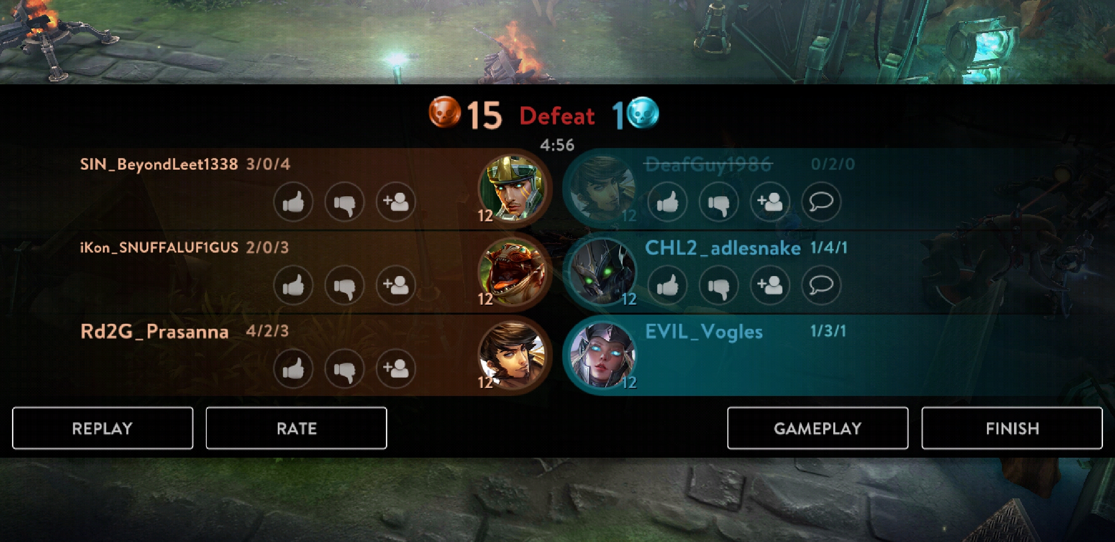
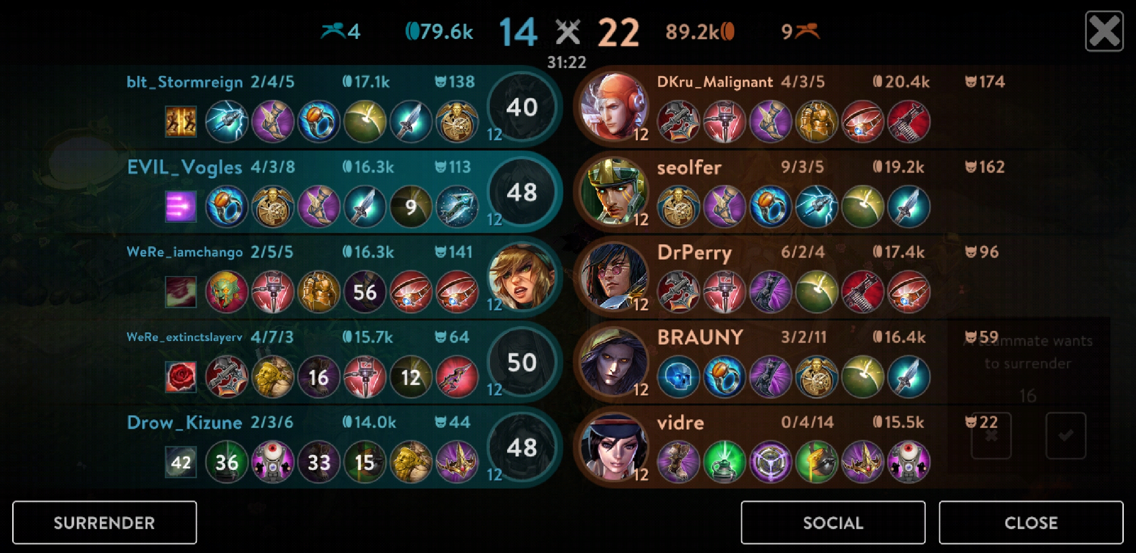
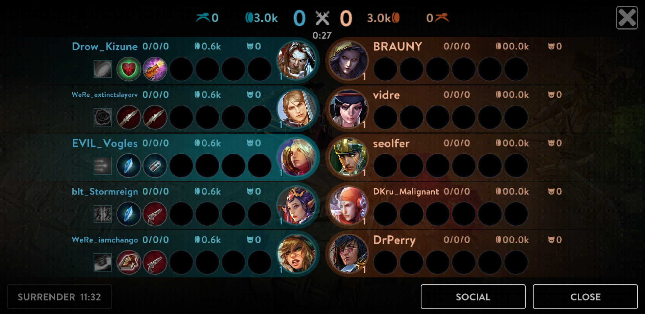
With the new 5v5 game mode in the final stages, Vainglory needed a new scoreboard. The previous one only had space for 6 players and we wanted to include more information about the state of the game. The new scoreboard, while designed for 5v5, is now also used in 3v3 matches. I worked with a UX designer to implement, and iterate upon, the new scoreboard. It was feature complete in about a month, with another month of QA & polish.
